Behold the cover for The Good Guy’s Guide To Getting The Girl! Lovely isn’t it. Isn’t it? Yes it is. No, no, really – it is!! And I won’t have anybody tell me any different because God knows how much pain and suffering I went through before we (my agent & I) finally settled on this beauty!
This post probably seems a little familiar. And so it should. It’s recycled, and updated, from the last time I thought I’d ‘finally’ decided on the cover. But no. Here we are again. Let’s hope this is the last time – for this book at least. I’m beginning to realise that the words ‘finished’ & ‘finally’ are dangerous things to say when talking about books.
So, just for fun, I thought it might be kinda cathartic to share with you *some* (and I really do mean some) of the designs that ended up being seriously considered, but ultimately tossed on the scrap heap. Everybody ready? Then buckle up people and prepare yourself for an emotional ride.
Above is a mock-up book jacket which I designed back in 2010 to help motivate me whilst I was writing the book. I figured if I had something I could see which represented my wildest fantasies of having the book published and then subsequently made into a movie, not to mention big name authors taking the time to give me a by-line I could use, I might be more inclined to get a move on and write the thing. I never really intended to show this to anybody, but it hung on my wall for months and months and months. Until it fell off.
Incidentally, that actually is my office wall. I took a picture of my Kylie calendar and my pin board and used those elements as the basis for the cover. And I realise that isn’t Kylie Minogue. In a deluded paranoid moment I decided to swap her picture for someone else in case her lawyers decided to pay me a visit.

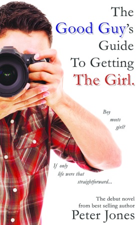
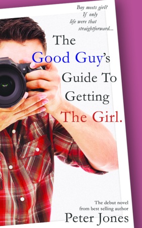
When my third & fourth books were published I realised I was missing a trick if there wasn’t at least a mention of my forthcoming novel at the back – and a ‘mention’ would be a whole lot more powerful with an image to accompany it. With this in mind I quickly bashed out this cover which is unashamedly based on the original edition of Della Galton’s novel Ice And A Slice. That cover featured an image of a girl with a drink (because that features strongly in the story) so logically I chose a fella with a camera.
At the time I really liked this. I liked it’s simplicity and I thought the bloke would appeal to female readers – a plus given that the book is actually classified as Women’s Contemporary Fiction.
Over time though I began to suspect it was a little dull. Worse still, friends I showed it to actually thought it might be non-fiction, rather than fiction – which you can’t really blame them for given that I have four self-help books under my belt. So when the time came to settle on the final cover design I decided to start with this idea, but tweak it as much as possible to make it look a little more ‘chick lit’.
Dear God. It’s difficult to know how this can look less finished than the previous version. I appeared to have gone backwards!
So the thinking here was take the previous idea, but turn the picture of Jason (that’s the protagonist) with his camera into a ‘polaroid’ laying on a coloured background. Except that, unless you had the paperback and could see how the image wrapped all the way round to the back (where there was a second polaroid image of Melanie – the love interest), it’s not at all obvious what’s going on here! Most of my friends said “what’s that purple bar thing at the side and top?”
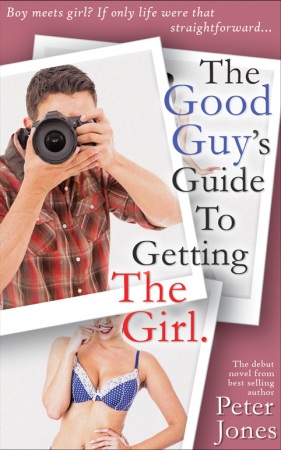
And so we arrive at what I thought, for quite a while, was the final version. The polaroids look like polaroids and we’ve got something for everybody; a handsome guy for the gals, and an absolute babe for the lads. I was a little worried that the title was getting lost but I was more than happy to live with it. Notice too how we’ve returned to the original ‘office wall’ background colour. All in all a job well done.
How wrong can you be.
A week or so later the cover was circulated around a couple of dozen potential readers (mostly ladies), and the general consensus was that this is not a good cover. The vast majority of women did not like the lady in the polkadot bikini – some said that would be enough to put them off buying the book! Worse still was the reaction to Jason – many people felt he looked like he was ‘hiding’ behind his camera, thereby making him seem creepy!

Never mind, thought I, all those issues could easily be addressed by re-casting Jason (notice how he’s not hiding behind the camera), and for that matter, Melanie (could she be any more ‘cute’?) Also, in this version my previous concerns about the title were finally resolved, and I love the interesting use of the multiple fonts.
However, something about it just isn’t right. Somehow in attempting to address all the issues raised we’d lost something along the way. This didn’t feel like my book any more, and I wasn’t sure it reflects the tone of the story. Not that my concerns mattered. Once the book was circulated again and feedback was – at best – luke warm, I decided to go back to the drawing board.
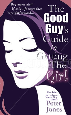
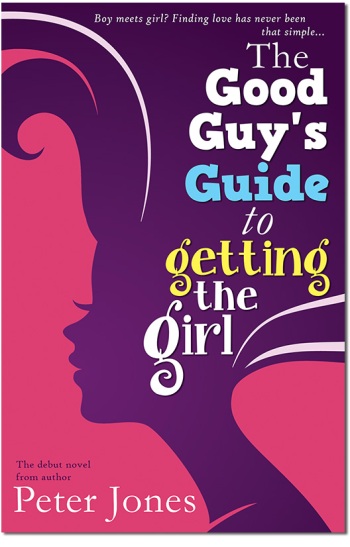
Take a look at titles by David Nicholls or Nick Hornby and you’ll notice the newer editions are very graphic, and it’s that element that we were trying to capture here. This was one of about six similar ideas, each with a different female face or profile. Personally this image was my favourite, but the title doesn’t quite fit and there were some fears that the woman is slightly too pretty, thereby alienating female readers (again!)

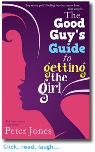
Which is why we finally settled on this one. And I have to say at the time I loved it. And I wasn’t the only one; here’s one of my favourite bits of feedback:
I love this one! I like the striking image and the colours and it’s exactly the sort of book I am drawn to pick off the shelves. I know that’s extremely subjective… I would assume (perhaps wrongly!) that this would be slightly more clever & comical than your average chick-lit offering.
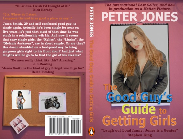
This was the cover that I launched the book with back in September 2014. You can read about how that went here, but the short version of the story is, the book did really well… in the first week. After that, not so much. It did however land me a deal with a new agent, AND a publicity deal with a very large online retailer. For boring legal & financial reasons we couldn’t just carry on with the same edition, it needed to be republished under a new ISBN. And if we had to do that then there was an opportunity to tweak a few things. Things like the cover.
I could have shot myself.
However, the general consensus was that whilst the image itself was probably ok – probably – the whole thing needed to be brighter, and it definitely needed to be more fun, to hint at some of the hilarious shenanigans inside the book. And even more female friendly to really attract that Women’s Contemporary Fiction audience. (But, but.. I want to be like Nick Hornby….)
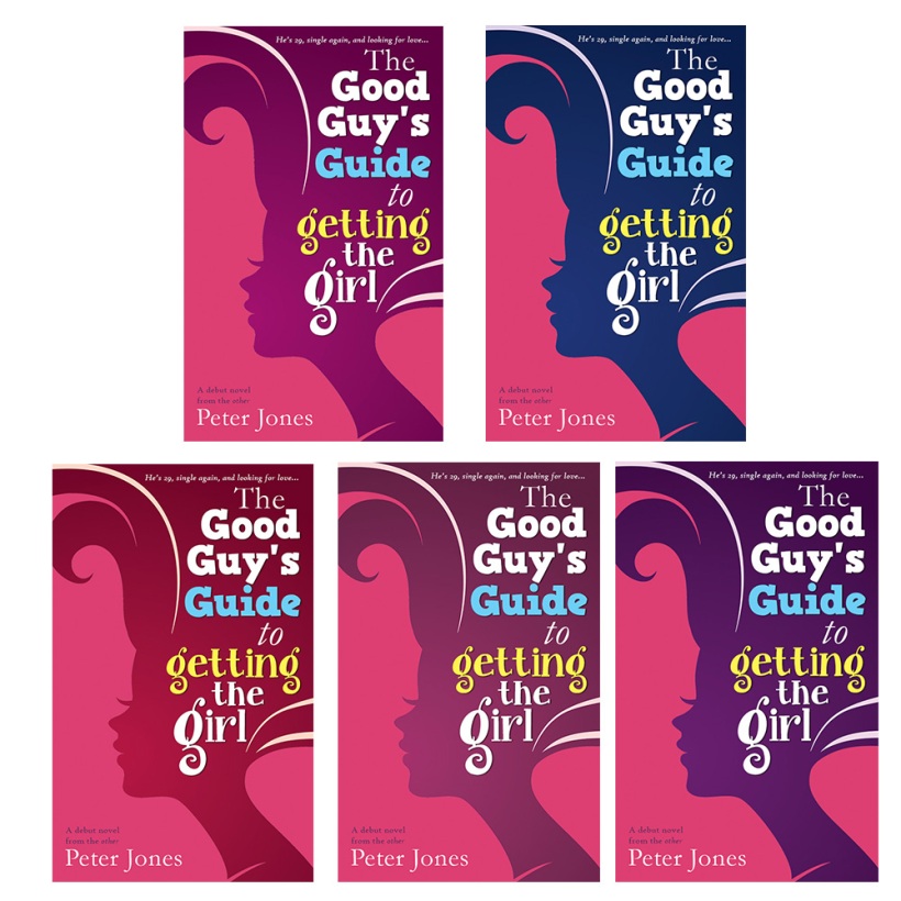
So, here are the five ‘final’ ideas we were presented with. Once we’d been around the houses a few times deciding on a new font (which is – I hope you’ll agree – more ‘fun’). My agent was delighted… but it took me a while to get used to the brightness, and the, er, pinkness. It’s very pink. Very very pink. I can’t quite believe that I’ve written a pink book! But then on the other hand, when I look back at the ‘first edition’ I can’t believe how drab that was!
Personally my favourite of these is number 4, the one in the bottom left hand corner (I like red). However, from a contrast point of view (important when you reduce the covers to the size of a thumbnail) numbers 2 and 5 are winning… which is why number 5 became the cover we went for in the end.
However… maybe we’ve got it wrong? Share your thoughts and feelings in the comments below.
Hot news; my debut novel The Good Guy’s Guide To Getting The Girl is part of Amazon’s 99p Summer Book Promotion. Get my quirky, lad-lit, rom-com for less than a quid! But hurry – the promo is for July only!
The film will be along some time in the next decade.

How fun to see the evolution of your book cover! I like the final choice, too 🙂
LikeLike
Thanks Sherrie 🙂 Glad you like it.
LikeLike
Great post Peter, I really enjoyed seeing the different covers and stories behind them. I definitely think the final version is the best – it looks so eye catching. Well done, Nikki x
LikeLike
Cheers Nikki – I’m relieved everyone seems to like the one we settled on.
LikeLike
An interesting insight, Peter, thanks for sharing. I’ve started bandying ideas around for my own novel cover and as soon as I mentioned one – reversing the letter ‘R’ in one of the words in the title – my partner said ‘But everyone will immediately think of Toys R Us’. A very valid point. Feedback and an objective eye is crucial to avoid a horrible mistake.
LikeLike
Wow – that book cover has come a long way! Really like you final design and
I have to say, two and five (the blue and purple) struck me more than the others x
LikeLike
Thanks Suzie – you and my agent are of one mind then, she also liked 2 & 5. Good job we chose number 5!
LikeLike